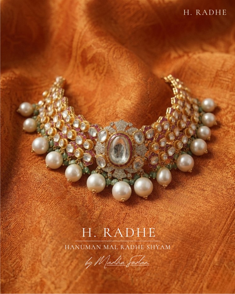
H. Radhe
Jewellery.
Brand identity and digital presence for a 50-year-old Bikaner-rooted polki house transitioning from B2B manufacturing to a direct-to-bride luxury brand.
From our hands. For your wedding.
H. Radhe is a Bikaner-rooted polki house with over five decades of manufacturing legacy. Generations of craftsmen have shaped the work quietly, consistently, and without a name in front — trusted by the trade, but invisible to the bride.
Every piece is made in their own workshop, by the same hands that have defined the work for years. No layers between the maker and the wearer. As the house moves from a B2B legacy to a direct relationship with the bride, the approach remains unchanged — measured, precise, and rooted in tradition.
Build a complete brand system for a heritage house entering the luxury direct-to-bride market.
The brief was to develop a complete brand identity for H. Radhe — visual elements, communication style, and digital presence — designed to work across print, social media, and web. The scope also included developing 3D visual outputs to enhance how the jewellery is presented online and in immersive AR try-on experiences.
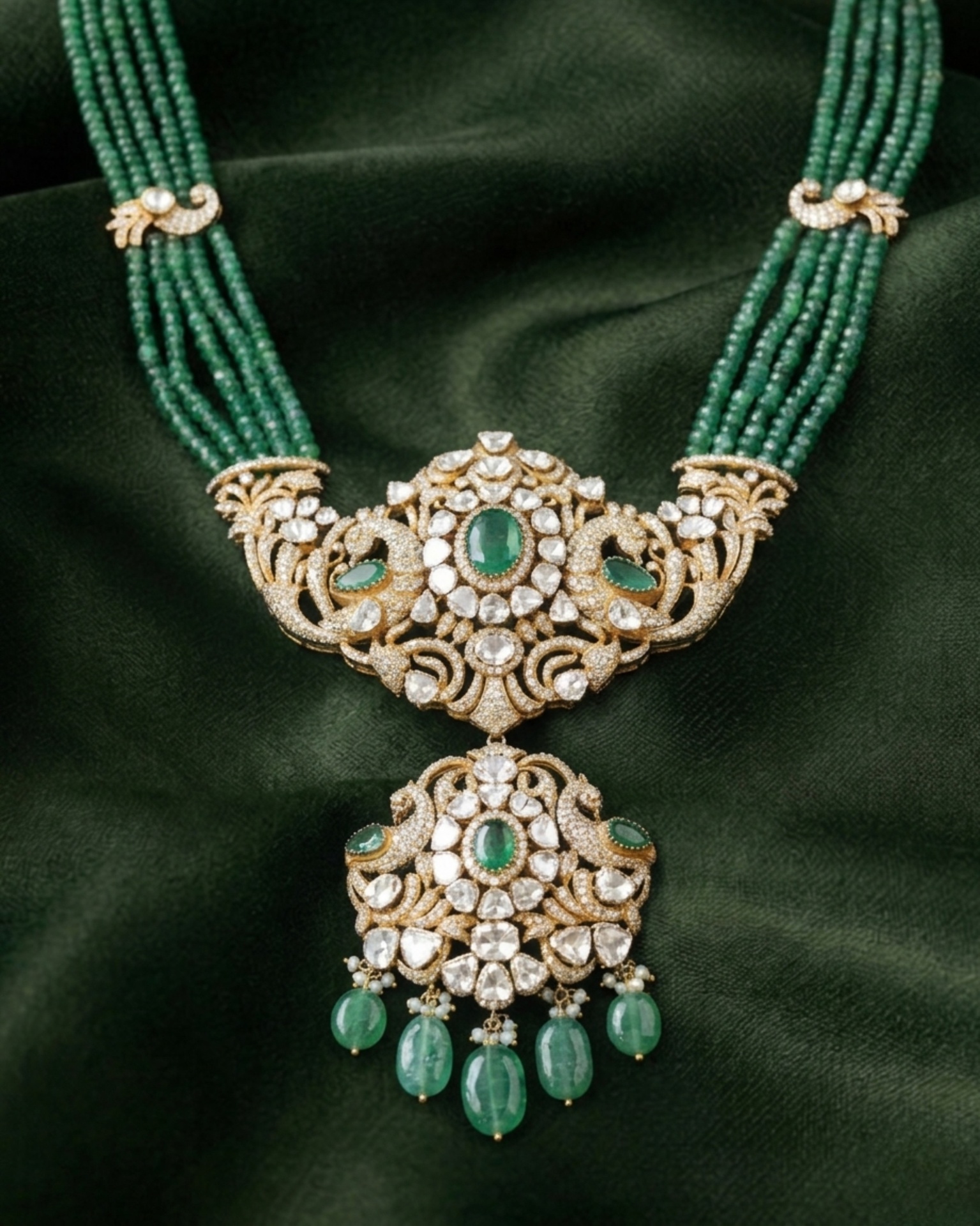
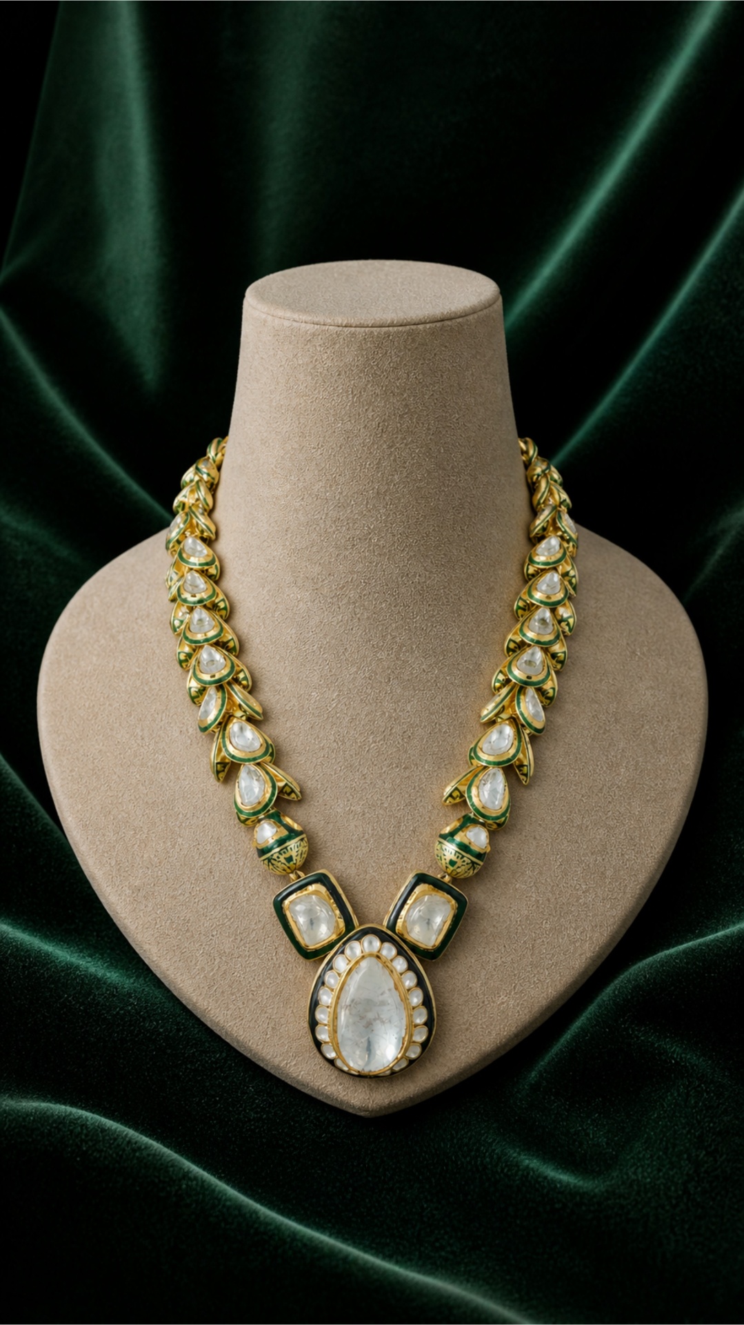
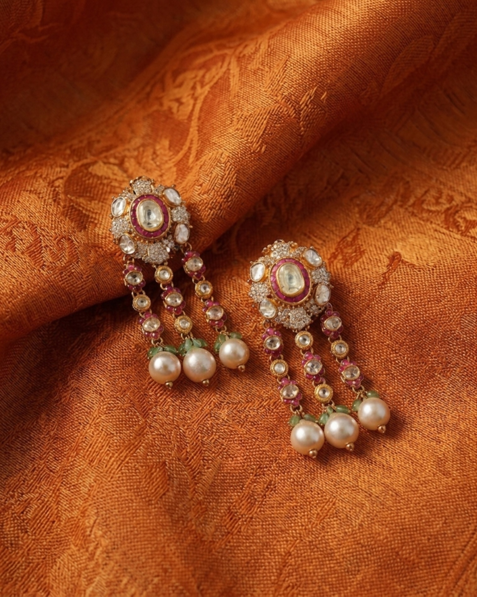
Polki — and what it actually is.
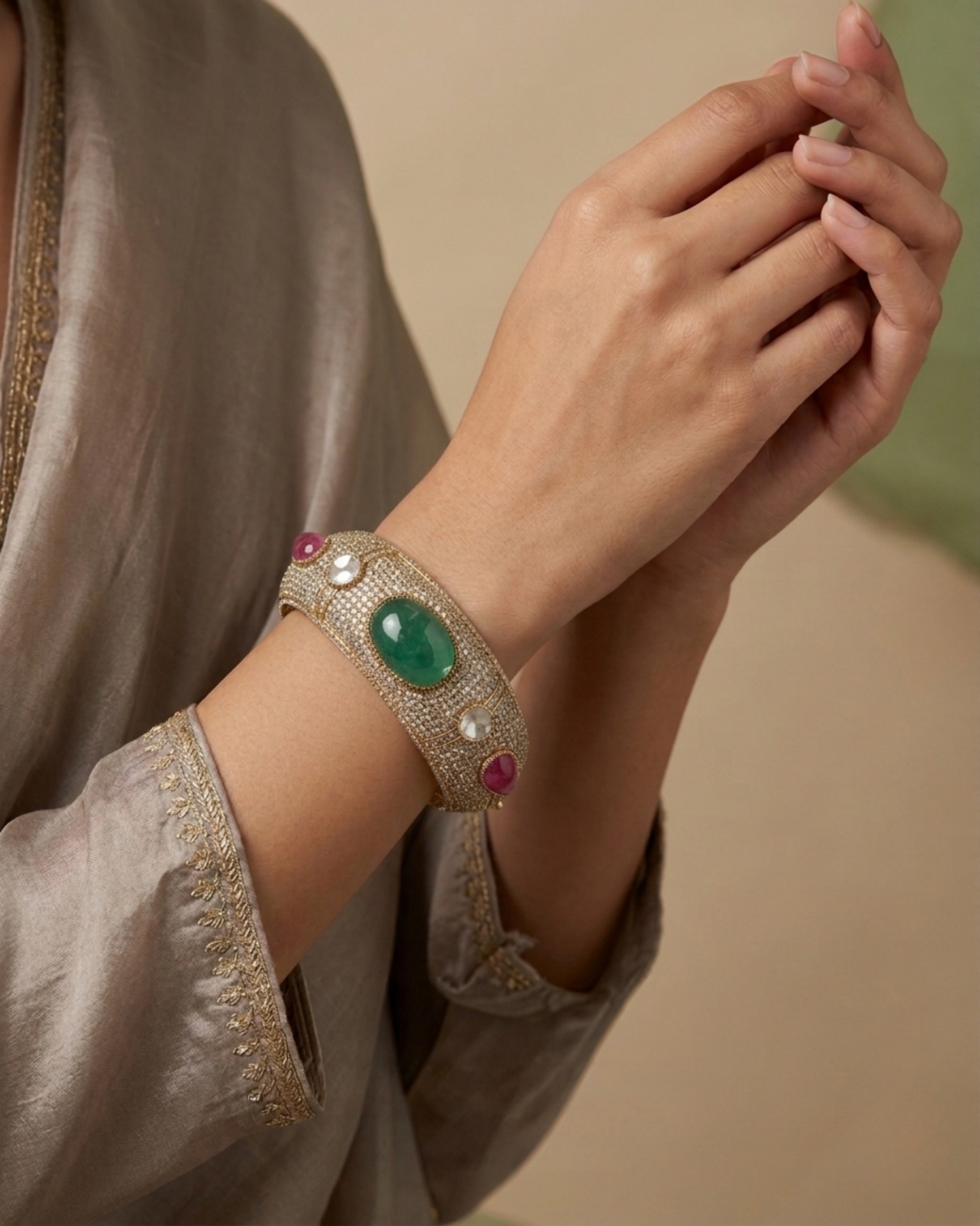
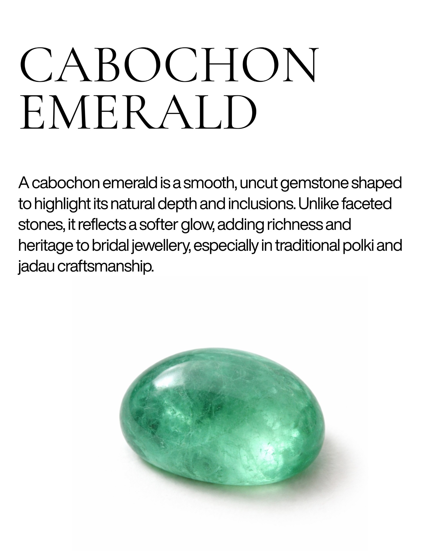
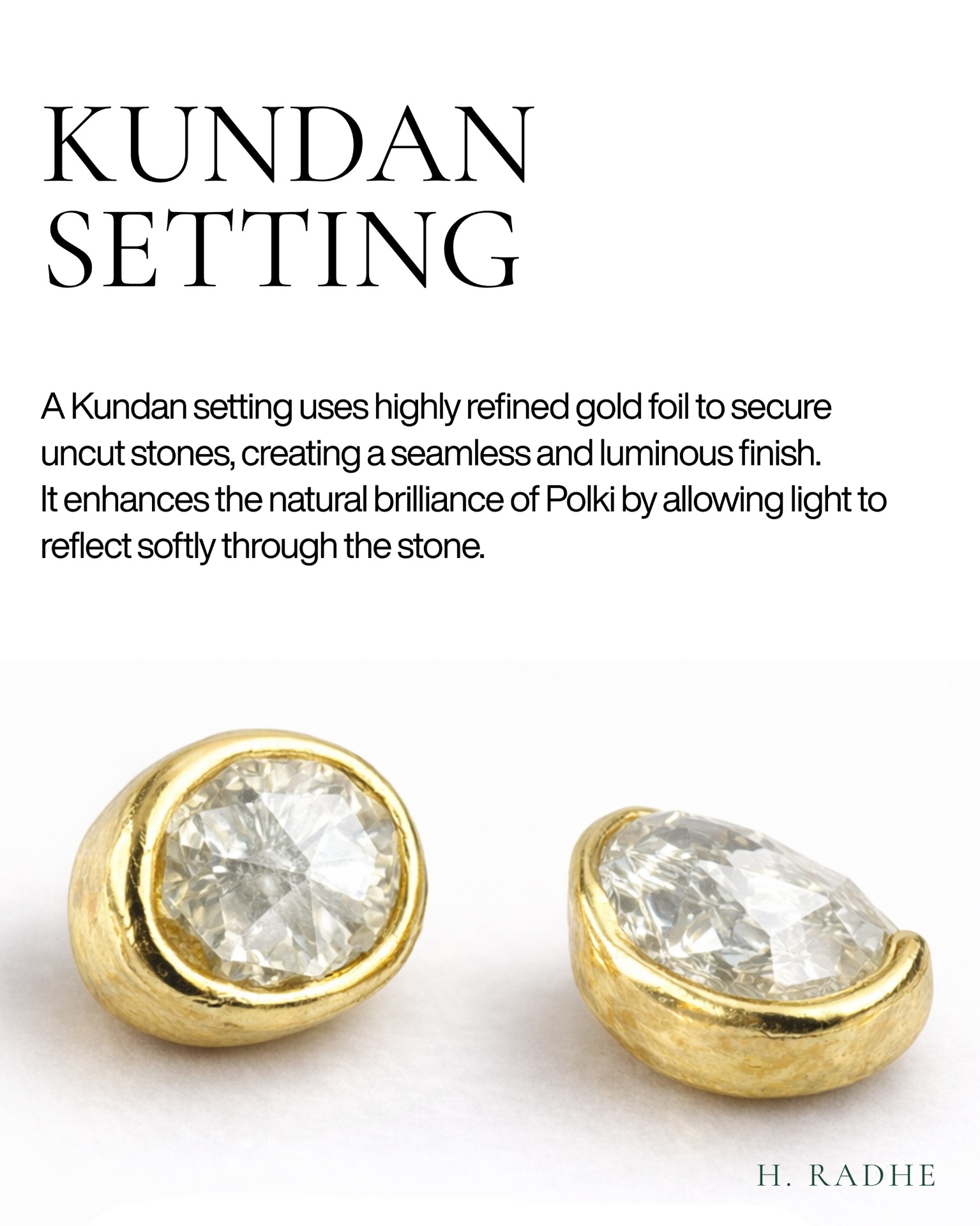
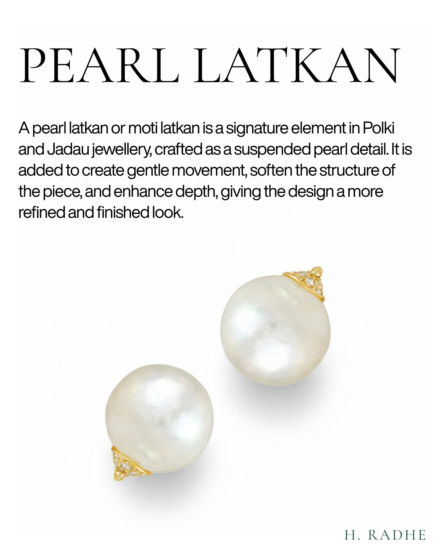
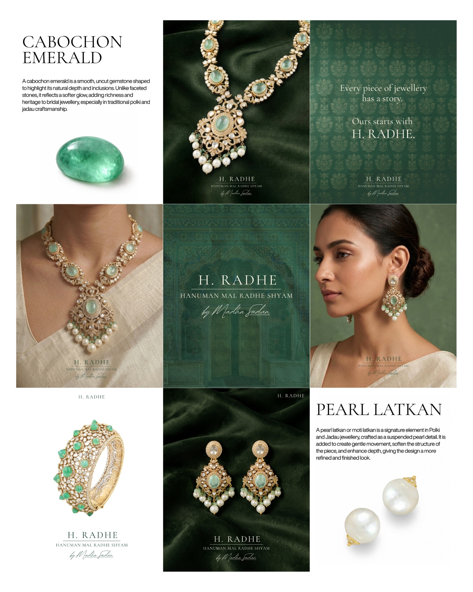
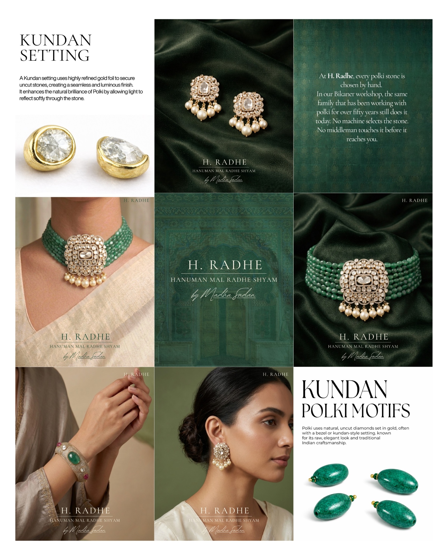
Polki is the uncut form of diamond — raw, unfaceted, naturally radiant. It carries a softness that faceted stones cannot reproduce. Combined with jadau, the centuries-old art of hand-setting stones in gold, it forms the heart of North-Indian bridal jewellery.
The research phase focused on understanding this craft category, the modern bride's references, and the visual language of competing heritage houses — defining a positioning that felt quiet, rooted, and unmistakably premium.
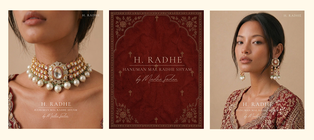
A face name, a heritage line, and a maker's signature.
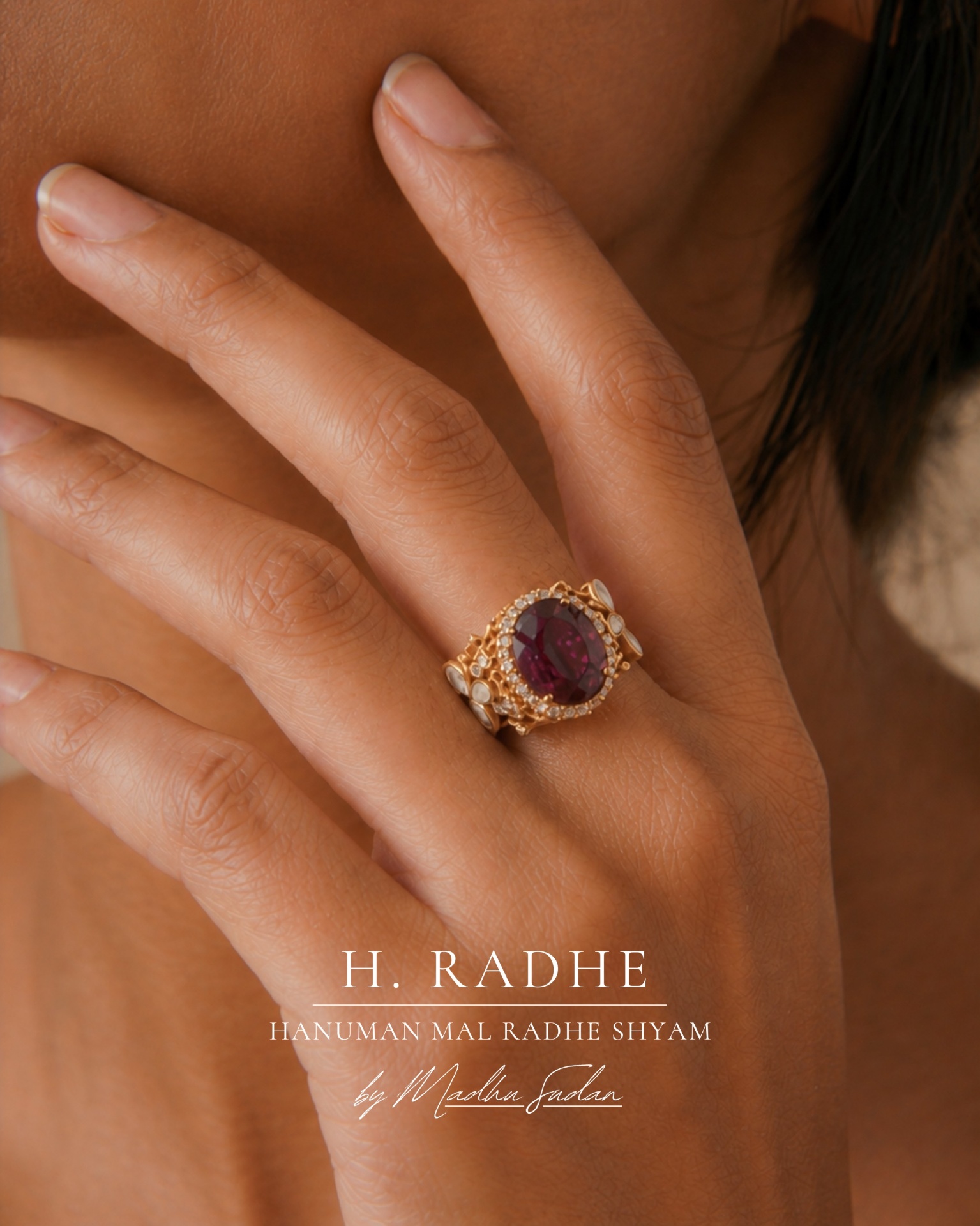
The previous logo carried recognition but missed the human story of the house. The refined identity keeps the face name H. RADHE for everyday touchpoints, layers Hanuman Mal Radhe Shyambeneath to signal legacy, and introduces the owner's handwritten signature — by Madhu Sudan — as a maker's mark that makes the brand human.
A grid built like an editorial — quiet, layered, premium.
The Instagram system pairs product shoots with model storytelling and editorial typography in a 1080×1350 vertical canvas. The grid follows an alternating rhythm so the feed reads as one continuous artefact rather than a series of posts.
Post exploration
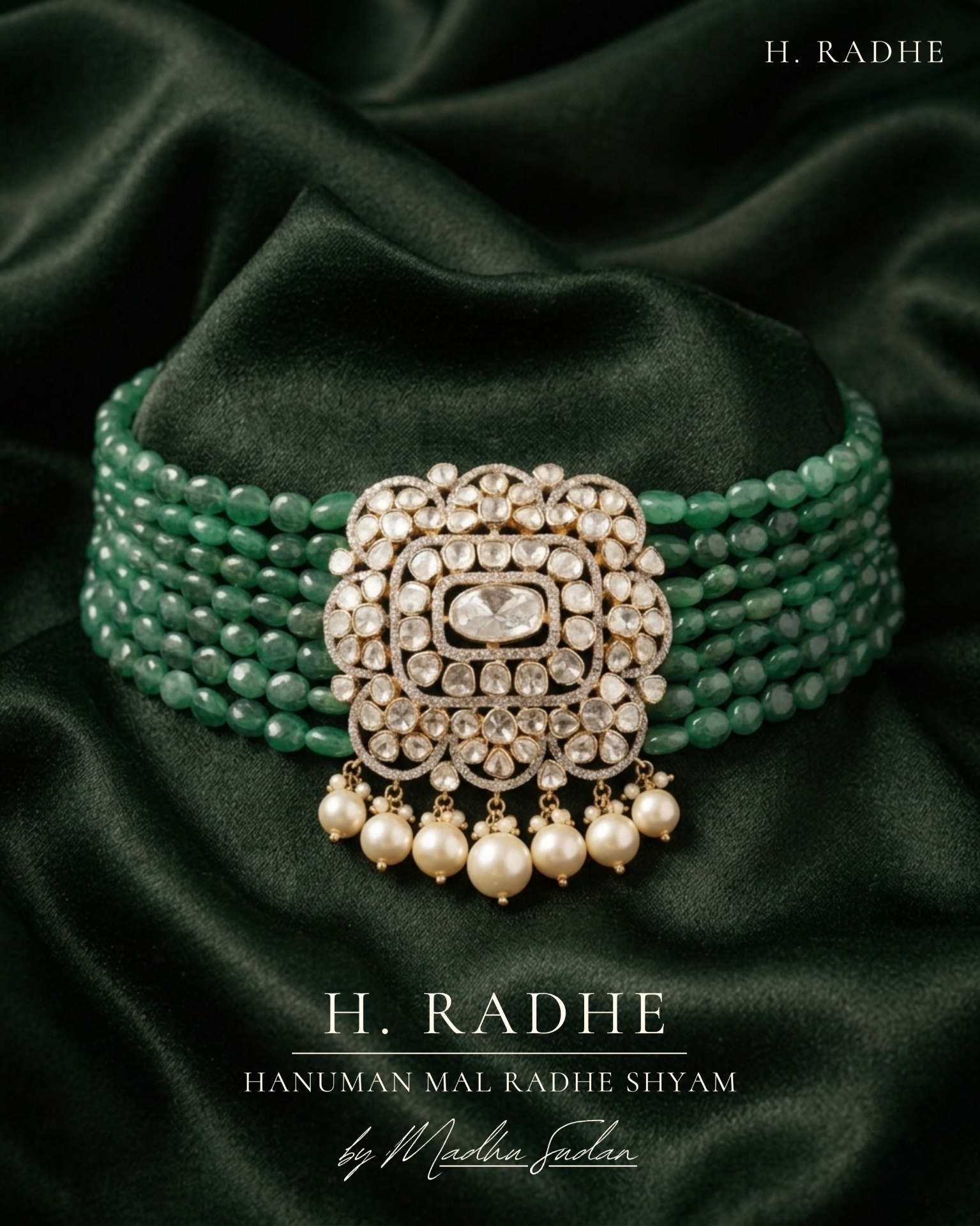
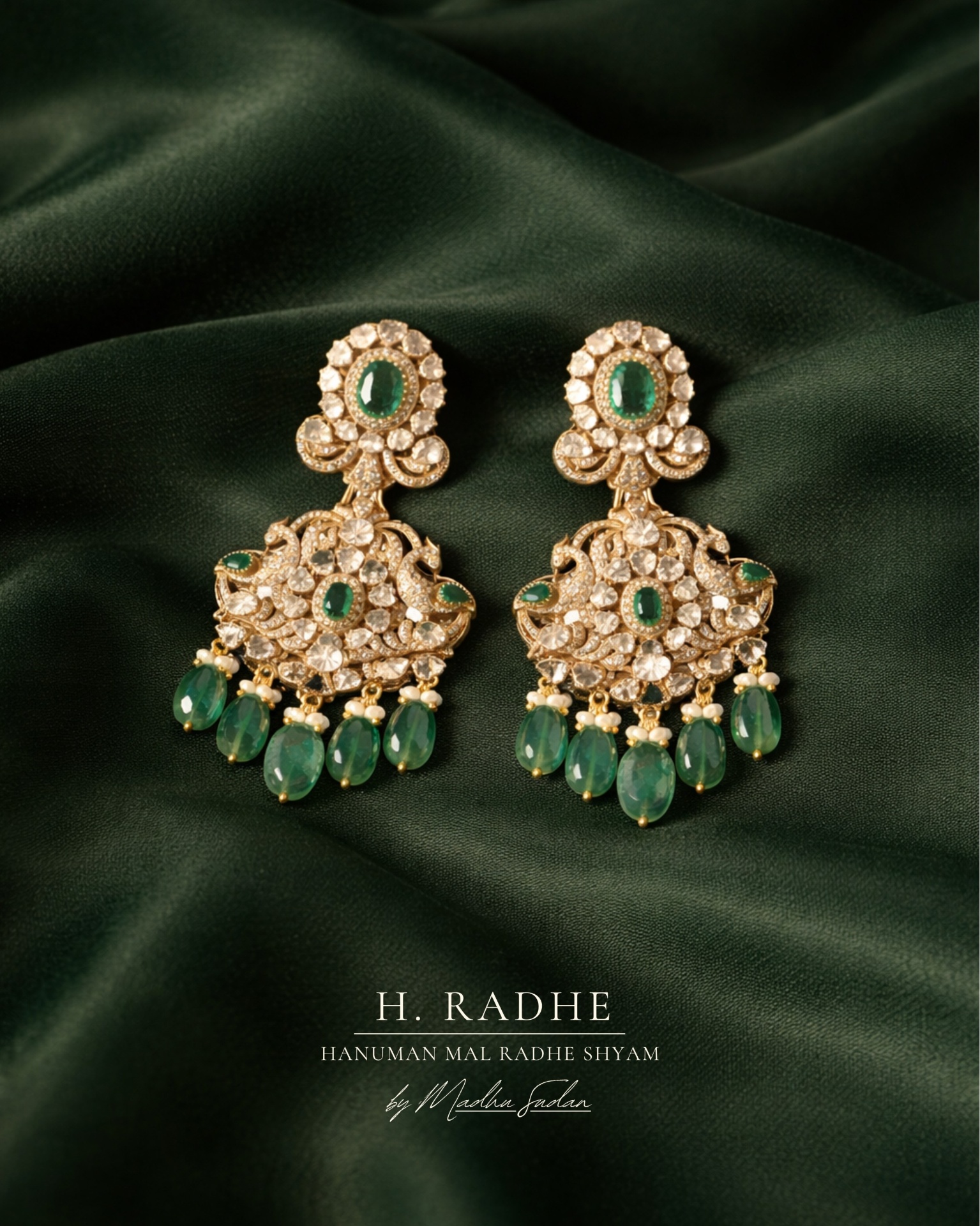
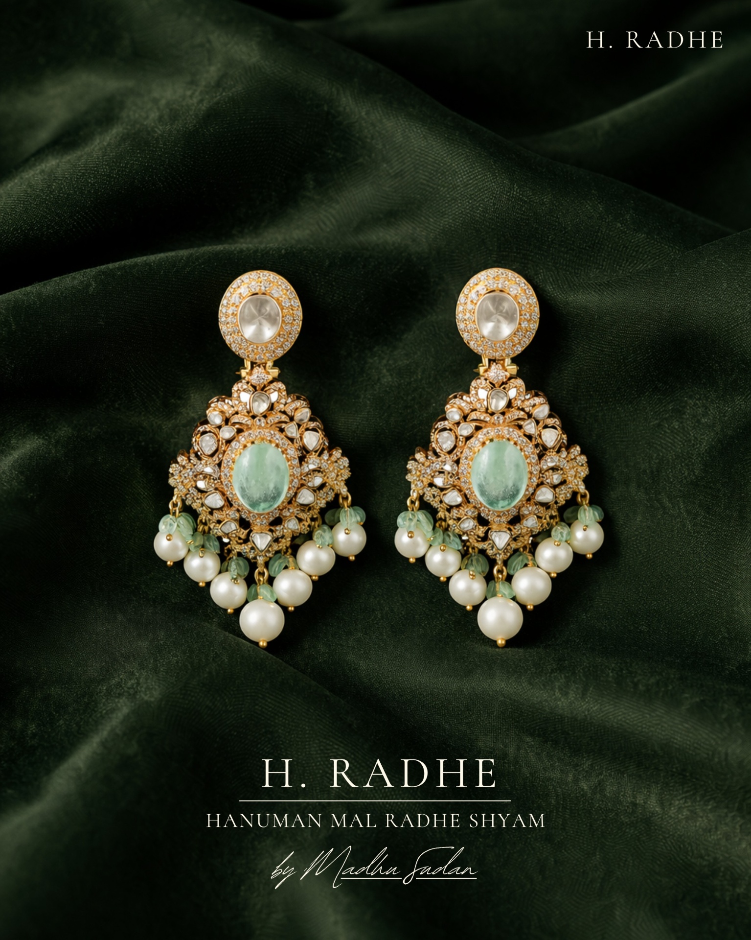
Polki & Jadau craft creatives
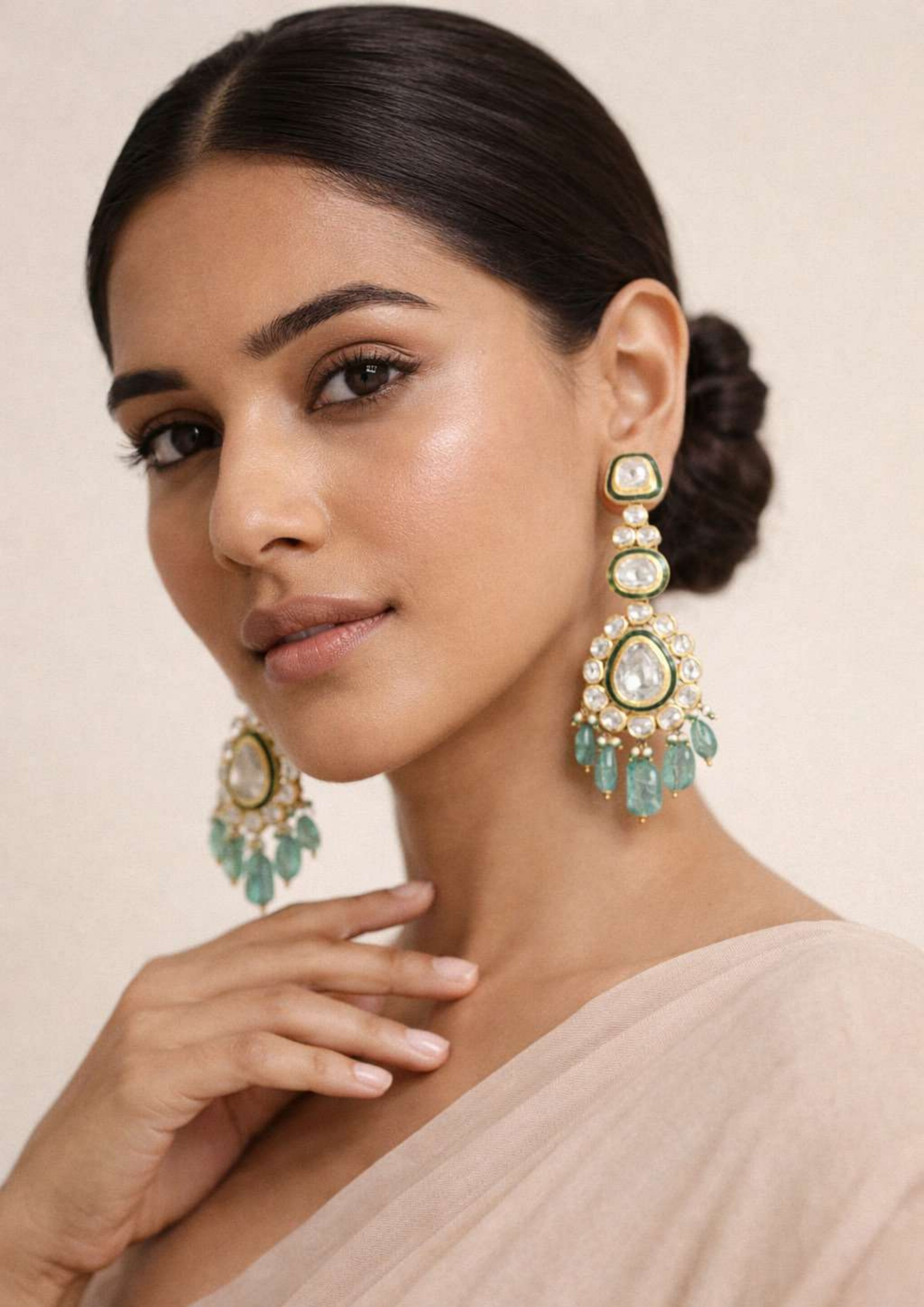
Product & model posts
A digital storefront for the bride — heritage on every scroll.
The website translates the identity into a calm, editorial e-commerce experience: a hero that introduces the house, collection pages for Polki and Jadau, a craft story, and an enquiry-first purchase model in line with the brand's no-price language rules.
- · Objective — translate the H. Radhe identity into a quiet, premium e-commerce experience.
- · Structure — Home · Collections (Polki / Jadau) · The House · Visit · Enquire.
- · Tone — short sentences, no scarcity language, enquiries only.
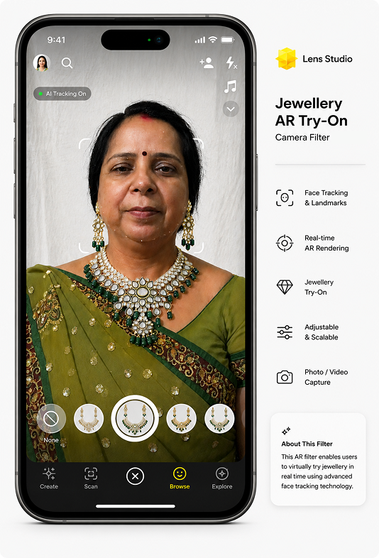
Try the jewellery before you fly to Delhi.
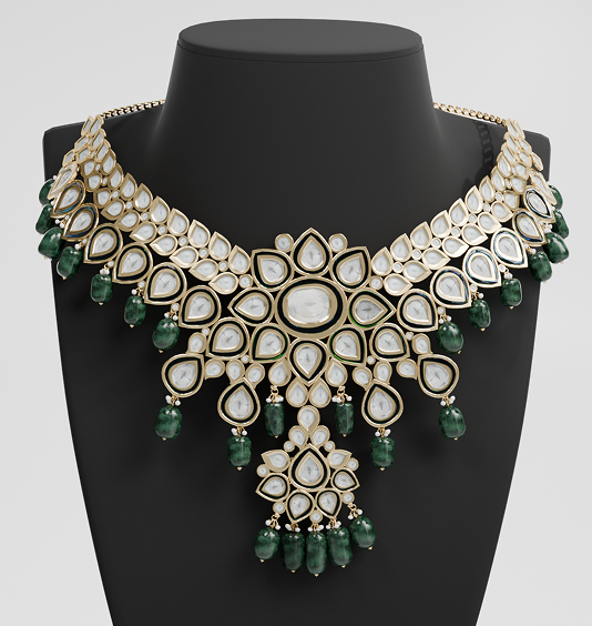
Each signature piece was modelled in Blender — gemstones, pearl latkans, bevels and metallic shaders — then prepared as lightweight assets for Lens Studioto power an AR try-on experience.
For brides outside Delhi, this turns the buying journey into something tactile again: open a Snapchat or Instagram lens, see the necklace on yourself, then enquire with the house. It also produced a library of photoreal renders used across the website and social grid.
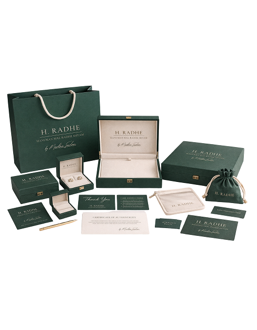
A box that opens like a moment.
The packaging system carries the dark-green and gold palette into a layered unboxing — outer sleeve, velvet bed, signature card, and care booklet. Stationery extends the identity into business cards, letterheads and brand collateral used across the workshop and showroom.
From a quiet B2B workshop in Bikaner to a modern luxury digital brand the bride can hold.
A complete brand system — identity, language, social, website, packaging, and an AR try-on layer — built end-to-end across 16 weeks of the H. Radhe internship.